The One-Screen Home Screen: A Simple Setup That Cuts Mindless Scrolling
A practical home-screen layout that reduces distractions: one page, a few essentials, and friction where it matters—without quitting apps.
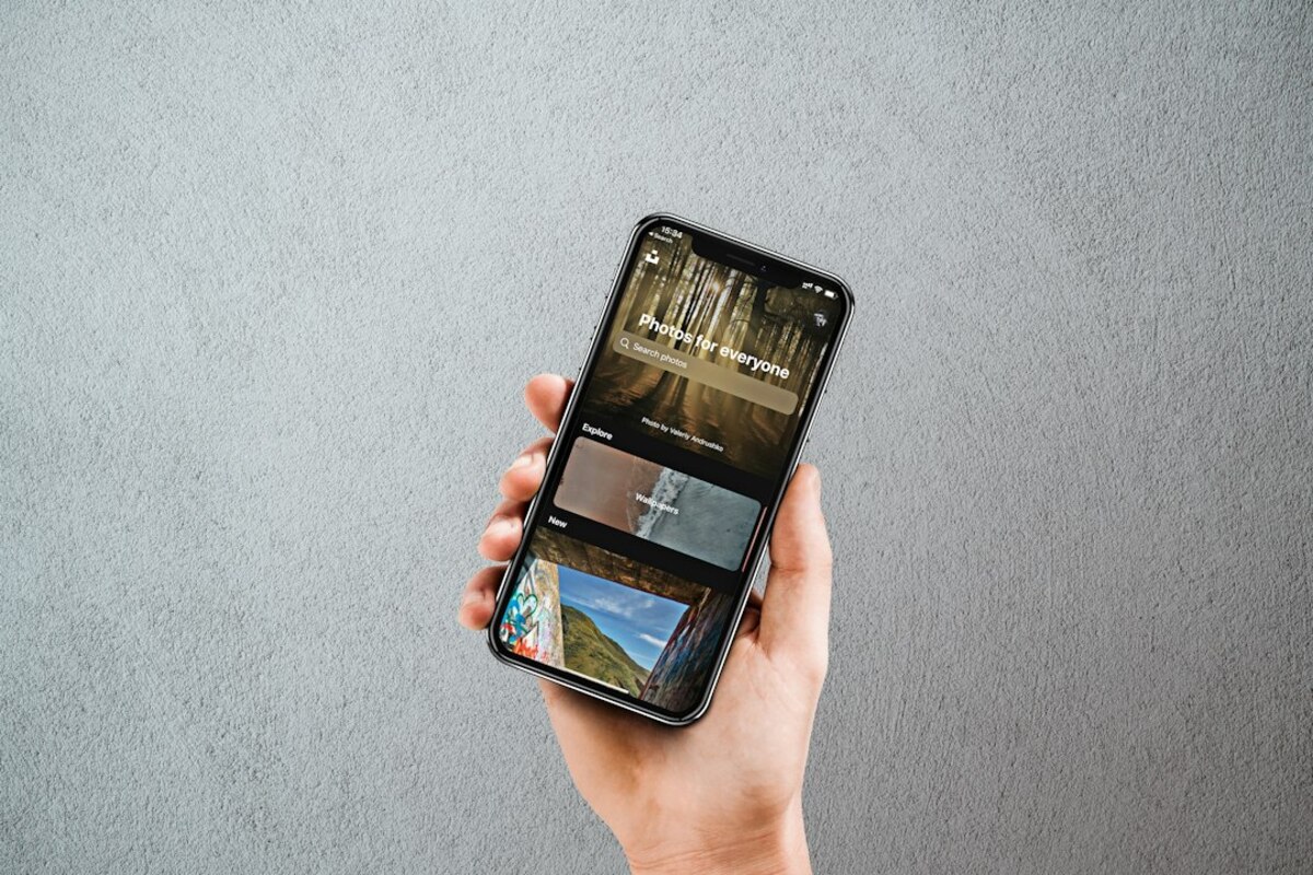
- A one-screen layout makes your phone feel quieter by hiding “maybe later” apps from constant view.
- Small friction (folders, limits, grayscale at night) helps you choose instead of reflex-tapping.
- You can keep the apps you love—just move them to intentional places so they stop hijacking idle moments.
Why your home screen quietly controls your day
Most of us don’t decide to spend 27 minutes scrolling. It just… happens. You unlock your phone to check a message, your thumb drifts to a familiar icon, and suddenly you’re watching a video about a kitchen gadget you don’t own. This isn’t a character flaw—it’s a design reality: your home screen is the “front door” to your attention.
Think of your phone like a kitchen counter. If the counter is covered with snacks, you’ll snack. If it’s clear and only has a fruit bowl, you’ll probably eat differently. Your home screen works the same way. The icons you see first are the ones your brain treats as default options—especially when you’re tired, bored, or in between tasks.
The “one-screen home screen” is a simple lifestyle tweak: you keep just one home screen page, and you only put the apps you truly need for daily life on that single page. Everything else lives in the app library, a second page, or folders that take an extra step to open. The goal isn’t to become a monk. The goal is to stop turning every tiny pause into an accidental internet trip.
Here’s a quick real-life scenario: you’re waiting for a meeting to start. You unlock your phone to check the time. On a busy home screen, your eyes catch social media, news, and shopping apps immediately—like candy at a checkout counter. On a one-screen setup, you see only your essentials, so you’re more likely to lock the phone again or do the one thing you intended.

How to build a one-screen home screen (without deleting anything)
This approach works on both iPhone and Android. The exact buttons differ, but the principle stays the same: make essentials easy and distractions slightly harder. Harder doesn’t mean impossible—it just means you have a moment to notice what you’re doing.
Step 1: Pick your “true essentials” (usually 8–12 apps)
Choose apps that support everyday life, communication, and navigation—things you’d reasonably need on short notice. Most people land on some mix of:
- Phone
- Messages
- Calendar
- Maps/Transit
- Authenticator/Password manager
- Music/Podcast (optional)
- Notes/To-do
- Camera
- Banking/Wallet (optional)
Notice what’s missing: apps that are “fun but not urgent.” Those aren’t banned—they’re just not allowed to sit at the front door.
Step 2: Create 2–3 folders for everything else
Folders are your “drawers.” You can still access what you need, but it’s no longer screaming for attention. A clean folder system beats having 18 folders because you’ll actually use it.
| Folder | What goes inside | Why it helps |
|---|---|---|
| Social | Instagram, TikTok, X, Facebook, Reddit | Adds a small pause before opening; reduces reflex taps. |
| Watch / Read | YouTube, Netflix, news apps, reading apps | Groups “time-expanders” so you open them intentionally. |
| Life Admin | Banking, bills, shopping, delivery, airline apps | Easy to find when needed, invisible when you don’t. |
Step 3: Remove extra home screens
If you currently have multiple pages of apps, you’re not alone. The trick is to stop browsing your own phone like a menu. Keep one page only. On iPhone, you can hide pages; on Android, you can remove screens or move everything into the app drawer.
If the idea makes you nervous, try a compromise for week one: keep a second page, but make it “tools only” (weather, calculator, settings, transit). No feeds.
Step 4: Design your dock like a seatbelt
The dock (bottom row) is the most powerful real estate. Put only apps that help you move through the day quickly:
- Phone
- Messages
- Maps
- Camera or Password manager
Avoid putting social media in the dock. That’s like keeping cookies on your nightstand.
Step 5: Use widgets sparingly (information, not temptation)
Widgets can either reduce app-opening or encourage it. A calendar widget can prevent you from opening your calendar app ten times a day. A “trending news” widget is basically a billboard for distraction.
Good widget candidates:
- Calendar (daily agenda)
- Weather (if it changes your choices)
- To-do list (top 3 tasks)
- Digital wellbeing/screen time (if you find it motivating)
Step 6: Make the “scroll apps” one extra step away
There are a few low-effort ways to do this without going extreme:
- Put them in a folder on the home screen (not page two). The folder click is the pause.
- Move them off the home screen entirely and rely on search/app library to open them.
- Log out of one app you overuse. Logging in becomes the pause.
That pause is the whole point. It’s the moment you get to ask, “Is this what I meant to do?”
Small friction tricks that feel surprisingly powerful
Once you’ve built the one-screen layout, you can add optional “micro-friction” that nudges your behavior without turning your phone into a brick. Pick one or two—more isn’t better if it becomes annoying.
1) Time windows for feed apps
Instead of “never,” try “not now.” Many people do well with two planned windows, like 20 minutes at lunch and 20 minutes after dinner. Use built-in tools (Screen Time on iPhone, Digital Wellbeing on Android) to set app limits or downtime. The point isn’t perfect compliance—it’s reducing auto-pilot use.
Example: If you always scroll in bed, set those apps to block after 10:30 pm. You can still override, but you’ll notice yourself overriding.
2) Notification triage (keep signals, kill noise)
Notifications should be like doorbells, not like someone tapping your shoulder every 30 seconds. A practical rule is:
- Keep: messages from real people, calendar alerts, delivery/ride updates, banking security
- Turn off: “recommended for you,” “someone liked,” “breaking news” (unless your job depends on it)
If you’re unsure about an app, try disabling notifications for one week. If nothing breaks, keep them off.
3) Make your screen less “candy-like” at night
Color is stimulation. If you often get stuck scrolling late, try switching to grayscale in the evening (many phones allow a shortcut or bedtime mode). It doesn’t make the phone unusable; it just makes endless content a little less sticky—like turning down the volume in a noisy room.
4) Use “search to open” as a built-in speed bump
When an app isn’t on your home screen, you have to swipe down and type its name. That tiny action often reveals your intent. Typing “Insta…” can be enough to make you think, “Wait, I’m supposed to be emailing my landlord.”
5) Put temptation next to effort
If you need social media for work, don’t bury it too deeply. Instead, pair it with a small reminder:
- Place social apps inside a folder named “Open with purpose”
- Or add a notes widget at the top with a prompt like: “What am I here to do?”
It sounds almost too simple, but a visible question can interrupt the trance.
Usually it does the opposite. Keep true work essentials visible (email, chat, calendar, docs). Put “support” apps (social, news, shopping) behind a folder or search. The aim is fewer accidental detours, not fewer capabilities.
Usually it does the opposite. Keep true work essentials visible (email, chat, calendar, docs). Put “support” apps (social, news, shopping) behind a folder or search. The aim is fewer accidental detours, not fewer capabilities.
Rely on search/app library for the first week. Your brain adapts quickly. Also, limit yourself to 2–3 broad folders so you don’t have to “remember a system”—you just open the obvious drawer.
Rely on search/app library for the first week. Your brain adapts quickly. Also, limit yourself to 2–3 broad folders so you don’t have to “remember a system”—you just open the obvious drawer.
It’s lighter and easier to maintain. Minimalist modes often change fonts, colors, or block apps. A one-screen home screen keeps your phone normal—just arranged so you interact with it on purpose.
It’s lighter and easier to maintain. Minimalist modes often change fonts, colors, or block apps. A one-screen home screen keeps your phone normal—just arranged so you interact with it on purpose.
If you want to test whether the setup is working, watch for one simple change: when you pick up your phone with no clear goal, do you put it down faster? That’s the win. Not “zero screen time”—just fewer moments where your attention disappears without you noticing.
You can also treat this like rearranging furniture. If an app truly belongs on the front page because it improves your day, put it there. If it mainly steals time when you’re tired, move it away. Your home screen should match the life you’re trying to live—not the habits you’re trying to outgrow.